

GARMIN INFORMATION ARCHITECTURE
Overview
Identify problem areas and optimization opportunities for garmin’s information architecture
I developed a comprehensive information architecture plan for Garmin’s website. Over the course of six weeks, I studied the target users, their needs and the current IA, and identified a strategy for improvement. Through research and user testing, I was able to establish pain points and optimization opportunities — ultimately resulting in a revised site map and navigation wireframes.
Role
Researcher
Information Architect
Product Designer
UX Designer
Timeline
6 weeks
Deliverable
Revised information architecture plan with medium-fidelity prototype
Objectives
Project Goals
Understand Garmin users’ needs/expectations
Determine how to organize site content, information architecture, and navigation
Gain new insights in rebuilding the design structure of the current website
business goals
Maximize ROI
Increase monthly sales/conversion rates
Increase monthly website unique visitors
Improve customer satisfaction and support
Increase number of monthly email subscribers
Be the industry leader in every market Garmin serves
User Needs
I conducted persona surveys with 10 target users. From the results, I developed a list of basic user needs to address their interests, goals, and frustrations:
To lead healthier lifestyles, physically and psychologically
Help getting and staying motivated during workouts
Set goals and scientifically measure progress
Improve performance in all aspects of their lives
Track improvement over time
Persona
With the needs outlined, I created a persona of Garmin’s target user to better establish empathy and visualize the user base.

Site Tasks
Next, I analyzed the common site tasks that a user would come to Garmin’s website to perform. Understanding and prioritizing these tasks helped establish the site navigation, information hierarchy, labeling, and taxonomy.
Browse products and compare prices with competitors
Find help tutorials and/or customer support
Learn about the Corporate Wellness Program partnerships
Look up product warranty and return policy
Update maps for accurate route and safety information
Share personal stats and engage with the Garmin community
Look at the blog for industry related content
Check online order delivery status
See what the featured apps are to enhance device functionality
Look up available job positions at Garmin
Garmin’s Current IA
Garmin currently categorizes all of its main nav under Products, Maps, Support, and Discover — creating a deep navigation structure. There is a lot of content on this site, which at times requires users to go through multiple layers to find their desired information. The products are organized by market first and then by product, which have some overlap within each sub-category. The Discover category seems to be a miscellaneous section, where Garmin has just lumped in all of the other pages that don’t fall into the previous categories. Most of the subcategories in Discover are labeled with brand names, that first time or infrequent users may not understand. Luckily, they do provide a brief description for each, but it could definitely hinder the predictability for users while navigating the site. The footer also has a lot of content within it, categorized under Customer Service, Company, Careers, Garmin Sites, and Partners.

Initial Tree Testing
An online tree test was conducted with target users to gain insight into Garmin’s site design and information architecture. I had 15 participants attempt to complete each of the 10 common user site tasks.
Overall, participants were relatively successful in completing most of the tasks correctly. Routes were direct and easy to find for purchasing and company information. However, participants struggled to navigate to support, corporate wellness, and apps pages. Garmin’s website has so much information that gets buried down in multiple layers — 53% of participants failed to find Apps buried in the Products section. Labeling is also unclear and confusing, such as “Discover” and “Garmin Connect” — 67% of participants failed to find Garmin Connect.

Pain Points
So much information, site is confusing to navigate
Users are overwhelmed
Information gets buried too deep, preventing content discovery and causing link blindness
A lot of brand name usage, not intuitive for users
Unclear and unfamiliar category labeling
Card Sort Analysis & Insights
Next, an online card sorting was conducted with 4 target users to further evaluate the information architecture. Overall, participants organized the topics and categories in pretty similar fashion. There was some confusion concerning products and product categories. Looking at the Similarity Matrix, the Support, Products, and Maps categories all had a high likelihood of being grouped together, while Discover was widely dispersed — broken out into relabeled topics such as Software, News, and Customer Service.
Iteration: Reorganize the information architecture to be more descriptive and revealing of sub-categories. This will increase content discovery and reduce navigation confusion.

Redesign Goals
Clear navigation labels and categorization, providing direction to users for easy accessibility and exploration
Uncover and reveal information and pages for users, less layers
Separate and provide clear paths for both consumer and business needs
Enhance content discovery
Site Map Sketches
With the insights gathered from the user tests, I sketched some revised site map ideas to address the pain points and redesign goals.

Initial Site Map Redesign
Mocking up a first round of design, I aimed to establish clearer primary navigation labels and provide direction to users for easy accessibility and exploration. I separated out Apps & Software, Learn and Business categories to help alleviate the issues of buried content, link blindness, and vague/confusing labels. Distinguishing the paths for both consumer and business needs on the website allows users to identify with their audience type. Additionally, products are now categorized by product type, rather than by market/activity, which leads to consolidated product index pages and less overwhelming confusion for users.

Validation Tree Testing
I conducted a second tree test to evaluate whether or not the changes I had implemented improved the hierarchical category structure. Overall, participants had a much higher success rate in completing the tasks, compared to the initial tree test. There was still some confusion regarding navigation to the Corporate Wellness (Task 3) and Garmin Connect (Task 7) pages. The highest increase in success rates were Task 2 (locate video tutorials) and Task 9 (find the apps page). 5/10 tasks had a 100% completion rate, compared to 2/10 in the initial test.

Test Insights & Iterations
Attempts to reveal more information and pages seemed successful in the second round of testing, providing users with more clarity and direction to navigate.
The biggest pain point was locating the Garmin Connect page.
Iteration: Move from Support category to Apps & Software.
Participants also had confusion finding Corporate Wellness — the Business category is too similar to the Company category in the footer.
Iteration: Change the global nav label to Corporate Wellness as its own category.

Revised Site Map
Simplifying the layout and implementing the iterations from the second round of testing, I designed the final Garmin site map.

Navigation Wireframe Sketches
Now that I had my site map solidified, I started to explore navigation revisions with primary, secondary and tertiary pages. In this exercise, I sketched different global nav possibilities — flat vs. deep, information hierarchy, visual lists, etc. Additionally, I brainstormed content navigation layouts for the secondary and tertiary pages — local nav, breadcrumbs, layout, etc.

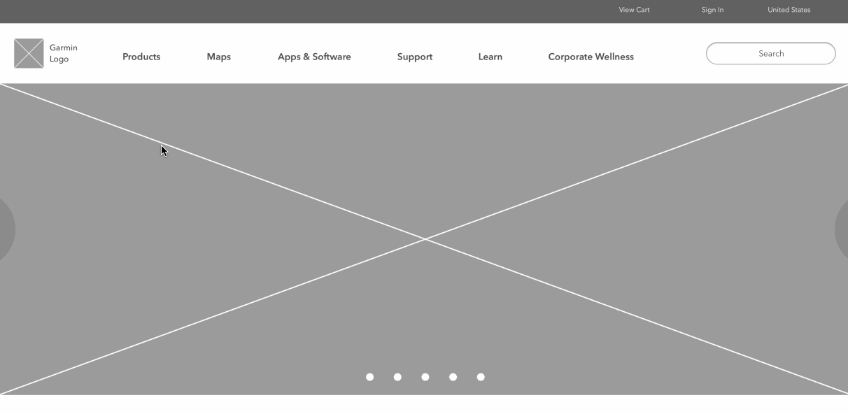
Navigation Wireframe Design
With this proposed navigation wireframe, I transformed the initial deep structure to more of a flat structure. This allows the content to be spread out over more descriptive category labels, preventing buried information and allowing better content discovery. To display the secondary and tertiary navigation, I designed the flow from Products > Sports & Fitness > Activity Tracking. Once users clicks on Sports & Fitness in the global nav, they are taken to that category index page, where there is a visual list of each product type within that category. (Originally, Garmin did not have clickable index pages from the Products dropdown, so users were forced to choose a specific sub-category from the home page.) From there they would click on Activity Tracking, taking them to the product index page. Here, users can browse and compare products or filter their search. All pages navigating away from the homepage have breadcrumbs at the top to provide users with feedback as to where they are within the site.

Final Prototype
(NOTE: Since the completion of this project in 2017, Garmin has updated their website to reflect similar changes that I recommend here. They have since added category index pages with visual product lists, as I suggested above. I noticed this when I was putting together my portfolio in 2018.)
Were the Goals and Needs Met?
Through multiple rounds of testing, a much better understanding of Garmin’s users and their needs was achieved. I was able to determine how to reorganize the information architecture and navigation in a more intuitive and accessible way — with clear labeling, categorizations and content organization. This eliminates user confusion and leads to better content discoverability and exploration — which in turn leads to more conversions and online purchases. Common user site tasks also now have a higher success rate of being achieved — meeting users’ site needs.